From e& back to Etisalat: why the UAE group reclaimed its name after four years
As it marks 50 years, the Abu Dhabi-listed group is dropping the identity it adopted in 2022, a move that says more about strategy than about logos.
Gulf ICT News | Analysis | 6 October 2026
Etisalat's return to its original name is not a cosmetic adjustment timed for an anniversary. In our reading, it is a quiet acknowledgement that the name designed in 2022 to carry one strategy no longer describes the strategy the group is pursuing today.
What happened
In a filing to the Abu Dhabi Securities Exchange on 6 October, the group said Etisalat is the name it is taking forward, describing it as a reflection of its heritage, its strategy and its ambitions for the AI era. A day earlier, a post on its X account said the company would begin its next 50 years under the name where it started, with no reference to e&.
Sheikh Mansour bin Zayed Al Nahyan, Vice President of the UAE, attended the launch of the group's 50th-anniversary celebrations, where the return to the historic name was announced. The symmetry is notable: he also launched the e& corporate identity in February 2022. Both the change and its reversal therefore carried endorsement at the level of the group's largest shareholder, a signal that this is a strategic decision rather than a marketing one.
Three stops in four years
The 2022 transition was gradual. The telecoms business initially kept the Etisalat name and logo; in June 2022 the UAE operator became "etisalat by e&", and Egypt adopted the same formula. The group later moved towards a fuller e& identity; the Dubai Metro station that carried the company's name, for instance, was renamed E& in September 2024.
In other words, the group travelled the full distance to e&, and has now come back.
Why now: four drivers
Names follow strategy, and the strategy has changed. The ampersand was the point of e&. The 2022 identity was presented as the expression of a plan to become a global technology and investment conglomerate, with a dedicated investment arm, e& capital. The new strategy is built on four engines: telco, AI and business solutions, infrastructure, and fintech. e& Capital is not among them. Reports over the summer indicated the group was reviewing parts of its expansion, including options for e& Capital and the Beehive lending platform, and in July it agreed to sell its stake of more than 16% in Vodafone to French billionaire Xavier Niel in a £4.4 billion deal. When the conglomerate thesis recedes, the "&" loses its reason to exist.
AI has made infrastructure valuable again. Four years ago, connectivity was treated as a mature, low-growth business that operators wanted to diversify beyond. AI has reversed that logic: models and data centres need enormous transport capacity. Alongside the name, the group announced a plan to raise international connectivity from 20 Tbps to more than 500 Tbps by 2030 to serve the UAE's AI campuses and cloud providers. In that context, a name that literally means "communications" becomes an asset rather than a legacy. The group itself framed connection as the purpose behind its 50 years, and one that matters more as connectivity, digital capabilities and infrastructure converge.
Customers never really changed the name. A brand's real value is set in everyday speech. In Egypt in particular, people kept talking about Etisalat calls, Etisalat branches and Etisalat top-up cards throughout the e& years. A brand the public does not adopt is an investment that never fully paid back.
The golden jubilee as narrative. The 50th anniversary gave the group a graceful exit: rather than reading as an admission of error, the reversal is framed as a celebration of roots. The specialist trade press was less diplomatic, calling it a U-turn while noting how low-key the announcement was.
From green to red: five logos in a quarter-century
The group's visual identity tells the same story in colour. Since 2000, Etisalat has gone through five logos:
2000–2006: a green square crossed by sweeping blue arcs, with "اتصالات" above and "Etisalat" below in blue.
2006–2022: the best-known and longest-lived mark, a lime-and-green droplet with the name in grey in Arabic and English. This is the logo a generation of customers in the UAE, Egypt and the group's other markets associate with the Etisalat name.
2022 (transitional): "etisalat by e&", the etisalat wordmark in white on black, joined to a red tab carrying e&, bridging the two brands.
2022: the all-red e& group mark, which removed the old name from the corporate identity altogether.
2026: the new logo, a lowercase "etisalat" wordmark in red, topped by an abstract symbol resembling a sphere cut by a horizontal curve.
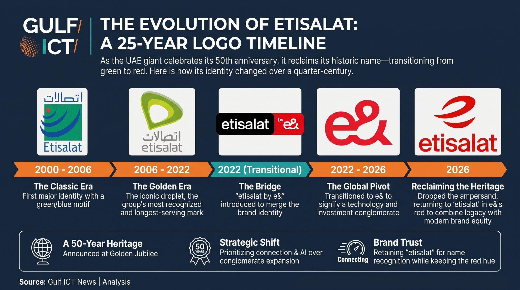
Notably, the new identity does not return to the green that carried the Etisalat name for 16 years. It takes the old name and dresses it in e&'s red. The group has reclaimed the name and kept the colour, combining the trust attached to the former with the visual equity e& built over four years among younger customers.
The symbol itself reads on more than one level. It suggests a globe crossed by paths of connection, but it can also be read as a stylised lowercase "e", as if the group kept the first letter of e& and dropped the ampersand. Nor does it reproduce the famous green droplet, suggesting the aim was not to revive the archive but to build something new from both eras.
Is this normal?
Refreshing a visual identity is routine for large companies, usually tied to a change in strategy, ownership or market. Changing a corporate name and then reverting within a few years is far rarer, though not unprecedented. The UK Post Office group became Consignia in January 2001 and announced a return to the Royal Mail name about 16 months later; Gap withdrew a new logo in October 2010 roughly a week after unveiling it.
The difference matters. Those were retreats under public pressure. Etisalat's reversal appears driven by a redefinition of strategy itself, which makes it closer to a deliberate correction than to confusion.
What to watch
The group's website still lists e& alongside subsidiaries such as e& International and e& Capital, leaving open how far the change will reach across its brand architecture. An early test is Pakistan, where the entity formed by merging Telenor Pakistan into PTML had applied to rebrand as e&, and may now opt for Etisalat instead.
We do not read this as a retreat from ambition, but as a redefinition of it. Four years ago, the ambition was for Etisalat to be more than a telecoms company. In an economy built on data flows, the group appears to have concluded that being a telecoms company is exactly what it needs to be.
Key Questions:
Why did e& change its name back to Etisalat?
The UAE telecoms group announced on 6 October 2026 that it is reverting to the Etisalat name as it marks its 50th anniversary. The group says the name reflects its heritage and its ambitions for the AI era. The change coincides with a new strategy built on four engines (telco, AI and business solutions, infrastructure, and fintech) and a plan to raise international connectivity capacity from 20 Tbps to more than 500 Tbps by 2030.
When did Etisalat become e&?
The group launched the e& corporate identity in February 2022 as part of a plan to become a global technology and investment group. Its UAE and Egyptian operators adopted the "etisalat by e&" brand in June 2022 before the group moved to a fuller e& identity in later years.
Is it common for companies to reverse a rebrand?
Visual refreshes are routine, but reversing a corporate name change within a few years is rare. Known precedents include the UK Post Office group, which became Consignia in January 2001 and announced a return to Royal Mail about 16 months later, and Gap, which withdrew a new logo in October 2010 about a week after unveiling it. Unlike those cases, Etisalat's reversal appears driven by a change in strategy rather than by public backlash.
What does the new Etisalat logo look like?
The new Etisalat logo, introduced in October 2026, is a lowercase "etisalat" wordmark in red, topped by an abstract red symbol resembling a sphere cut by a horizontal curve. It keeps the red colour of the e& identity (2022) rather than returning to the green of the 2006–2022 Etisalat logo. It is the group's fifth logo since 2000.